From informative websites that are designed for lead generation to e-commerce websites that rely on product sales, effective CTAs are a must-have in any industry. CTAs, or calls to action, are tools and functionalities that are designed to lead a user to complete a specific action. Often stylized as buttons or links, calls to action help convert website users into leads or buyers. Here are a few tips to help you get the most user interaction from your calls-to-action.
1. Use Exciting Verbiage
Your calls to action should be using action-oriented text that excites your user. For instance, if the action is having a user download a white paper, a button titled:

will stand out far more than a button that reads:

The first option adds a sense of urgency to your action, while the second draws less interest. Phrasing your button text in first person is also a plus, as it makes the experience more personal for the user. That is:

2. Primary vs. Secondary Buttons
Most companies include several different calls to action throughout their websites. However, having multiple primary calls to action in one section can overwhelm your user. That is why it’s important to have both a primary and secondary styling for buttons. Your primary button should be the button that allows the user to complete the most common or important goal on your site. Because this is the most important user action, you will want to draw more attention to this button. The secondary button is any user action that is less important to your sites main goal.
Let’s look at Twitch.tv homescreen for an example:

Source: Twich.tv
Notice how the “Sign Up” button is more prominent than the “Log In” button. This tells us that the primary goal for users on this page is to get new users to sign up for an account.
3. Use The Gutenberg Rule
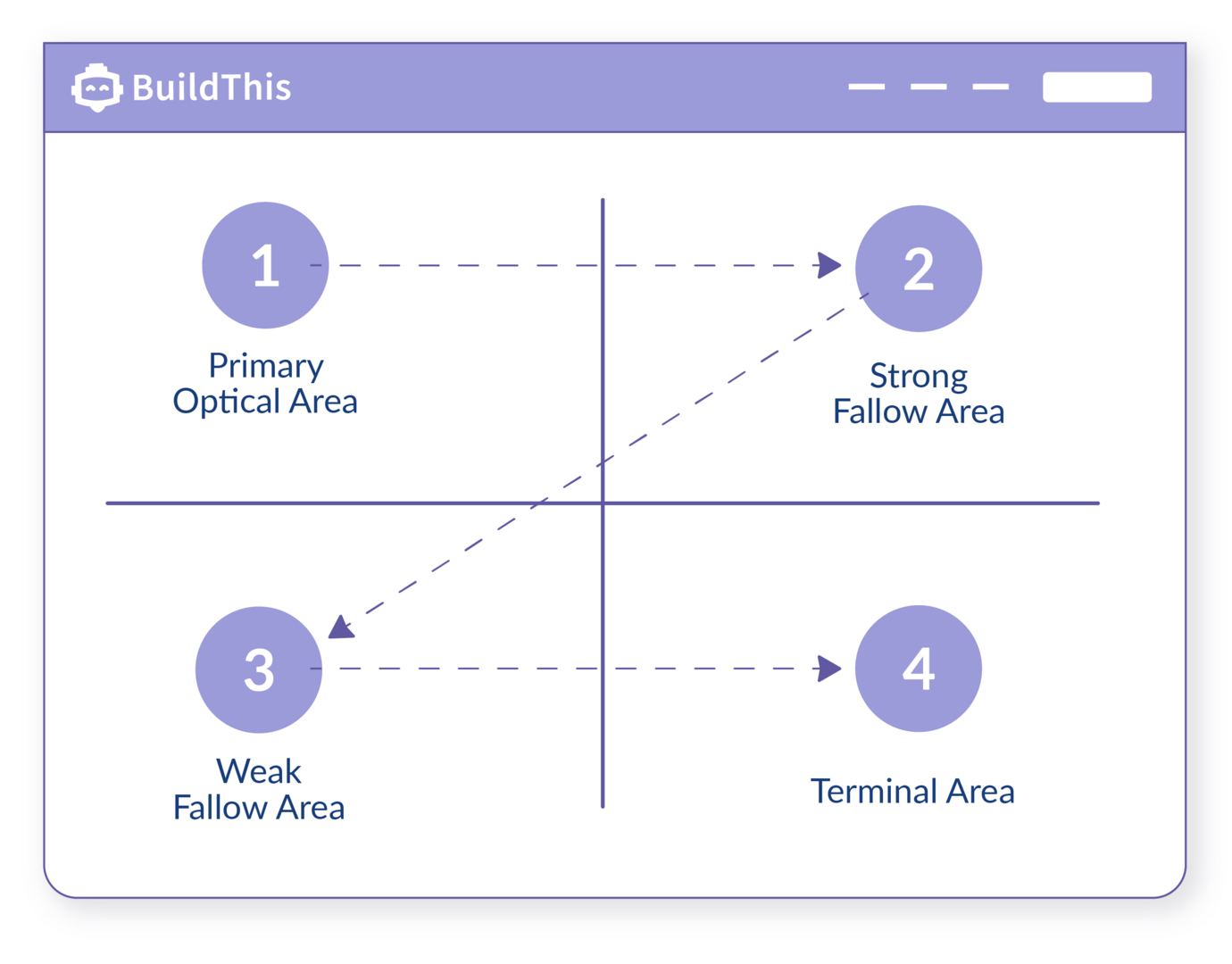
The placement of your calls to action matter. Believe it or not, most users that are browsing your website have visited hundreds and thousands of other websites. This means that your users subconsciously expect buttons to be placed in specific spots. This, in part, is due to a design principal called the Gutenberg Rule. Simply put, the Gutenberg Rule explains how users scan content when it’s displayed on a page.
Using this rule, you can see why most websites follow the same layout structure. This is because your brain is used to reading from left to right, and up and down. The Primary Optical Area usually contains a company logo, while the Strong Fallow Area and Terminal Area are often used for calls to action.

4. Design Matters
You can use correct verbiage and spot-on placement, but if your buttons are poorly designed, your calls to action will be fruitless. For starters, it’s important that your button looks and feels like one. I mentioned earlier that your users somewhat expect your website to be laid out in a specific way, and the same goes for button stylings! Most users have grown to know what a button looks and feels like, so make sure you keep it simple. Using contrasting colors to style your button will go a long way, is it will help make your call to action pop off the page. Also remember to use contrasting color ratios that are accessible. There are plenty of online resources to check if your color ratios meet ADA guidelines, like this one. Give your button enough top and bottom padding to ensure it has a good amount of negative space around it. It’s important to make sure all of your buttons are optimized for mobile layout as well. In its Human interface Guidelines, Apple recommends a minimum target size of 44 pixels tall by 44 pixels wide, giving your users enough space to click comfortably and accurately.
5. A/B Testing
The best way to ensure you have the most effective call to action is through A/B testing. It’s important to try out different layouts and styles with your CTAs to see which version receives the highest response rate. If you have a “Contact Us” button at the bottom of your page, try adding the same call to action in the middle to break up content, or towards the top of the page and above the fold. Then, you can look back at your lead data and Google Analytics data to compare which buttons receive the most user interaction.
